Phase 1: Brand Audit
Analysis of Autonomy's current brand identity across website, reports, and the consultancy arm.
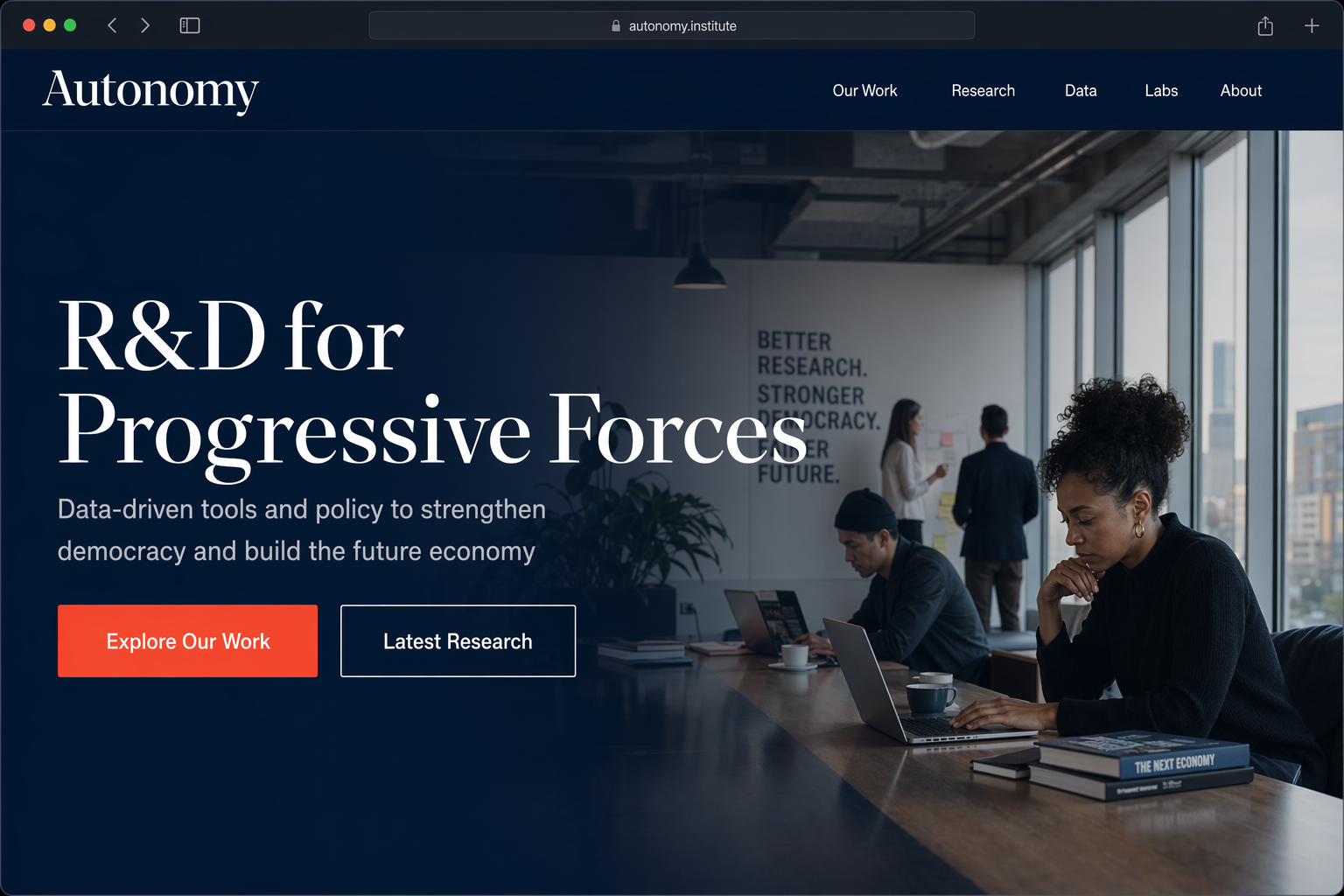
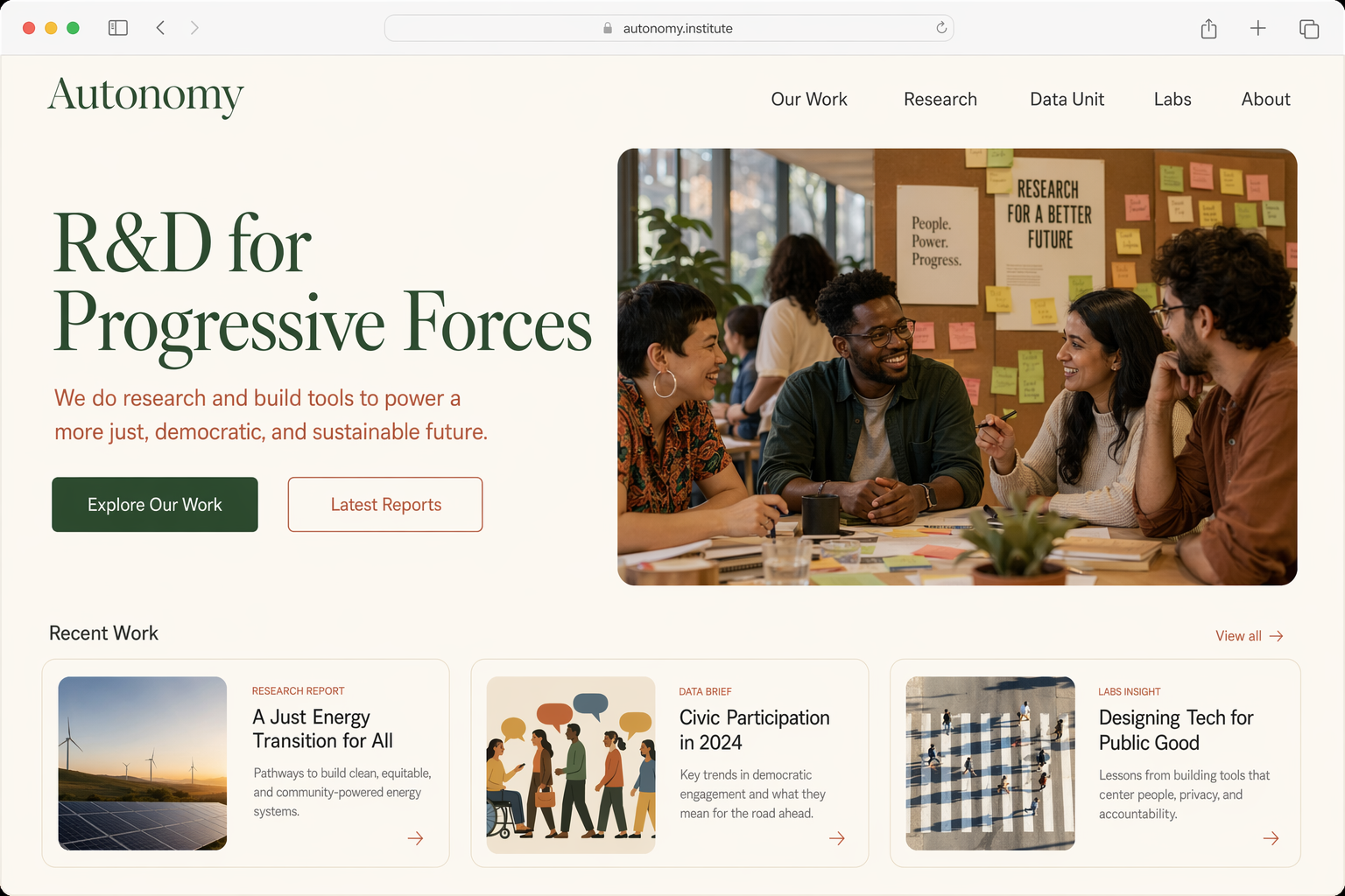
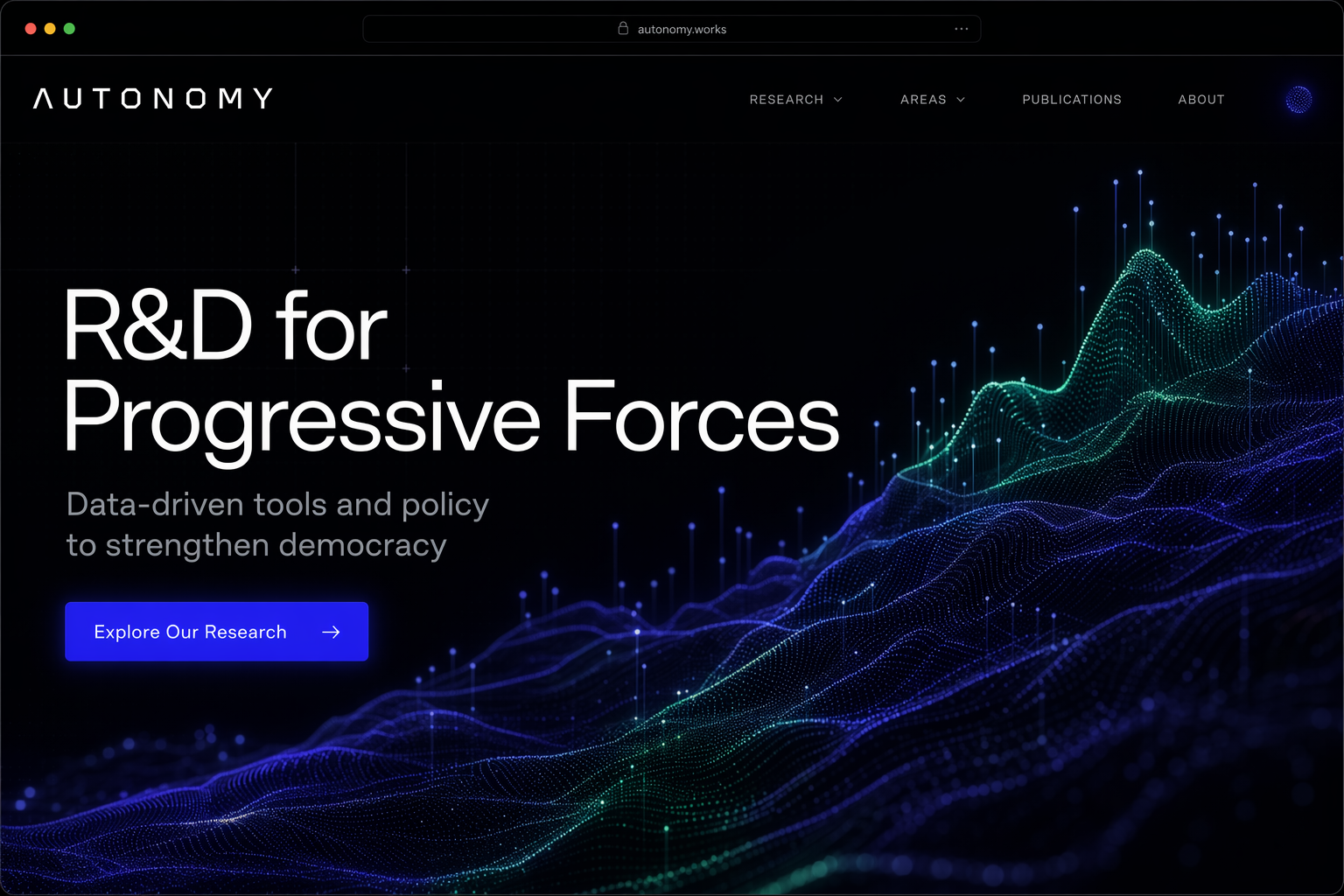
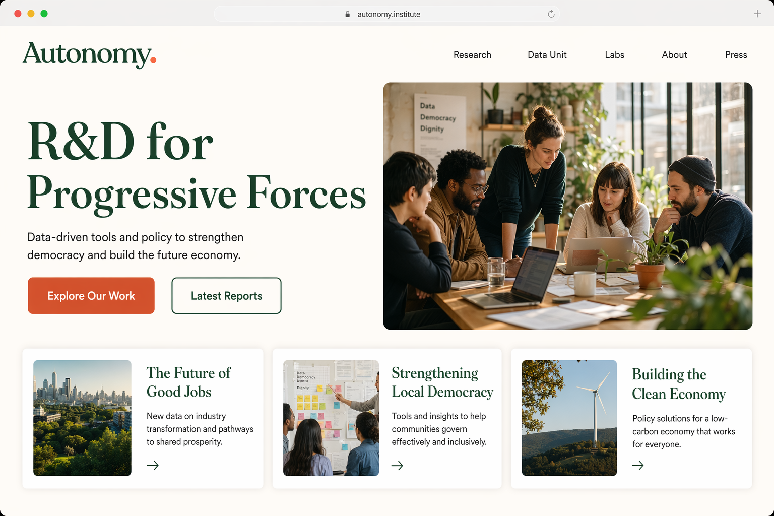
Current Website
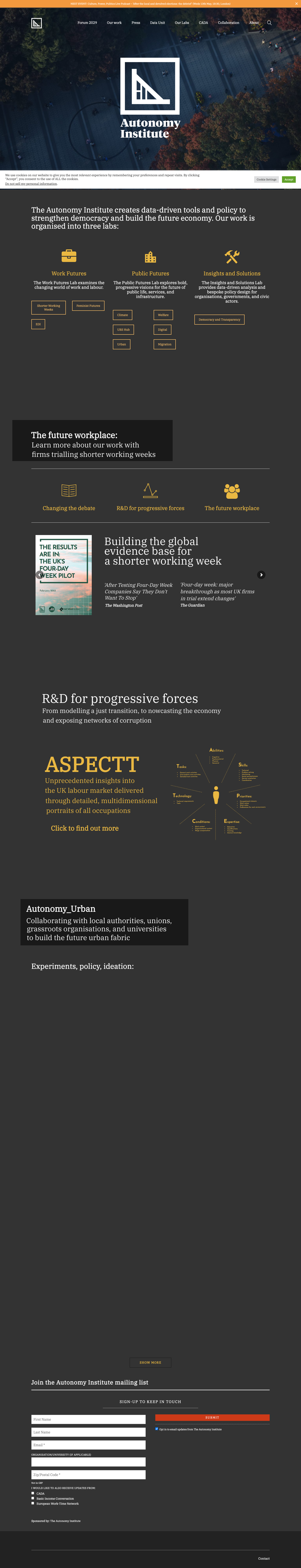
Homepage (Desktop)Dark charcoal background with golden amber accents. IBM Plex Serif throughout.
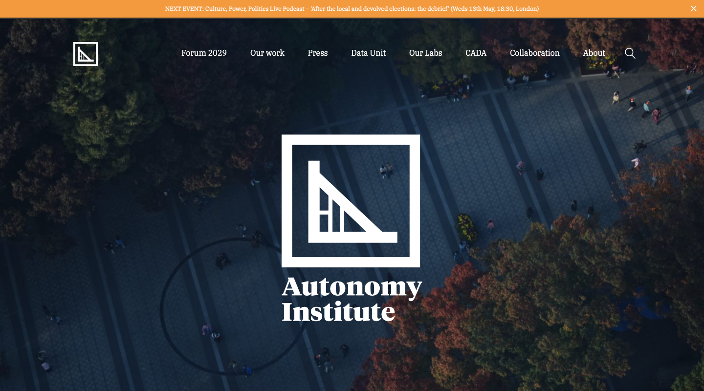
Header & Hero AreaFull-bleed photography with centered logo lockup and white navigation.
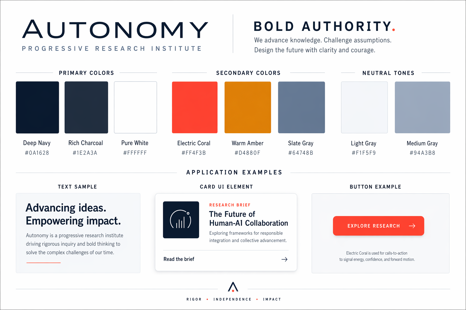
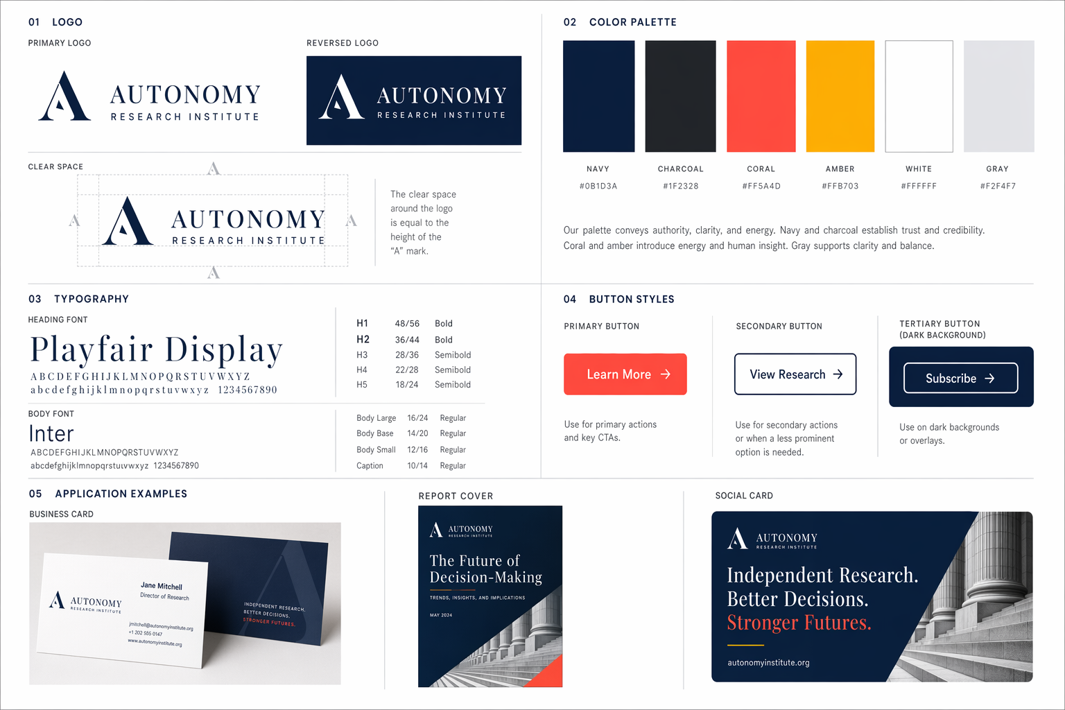
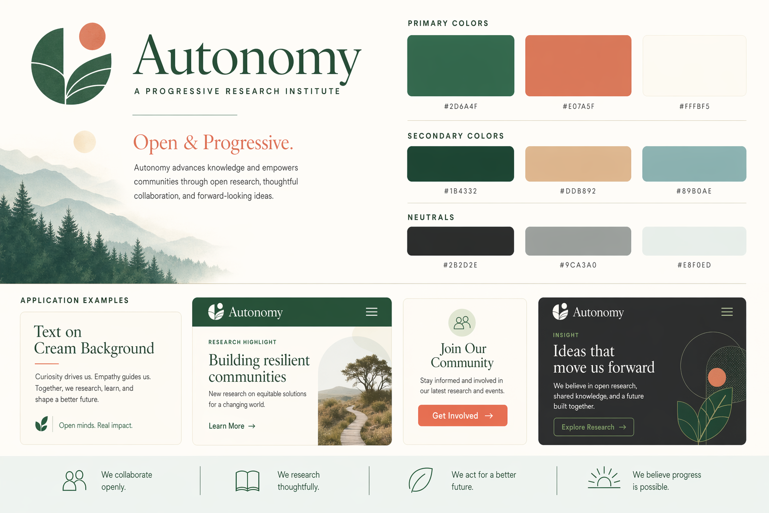
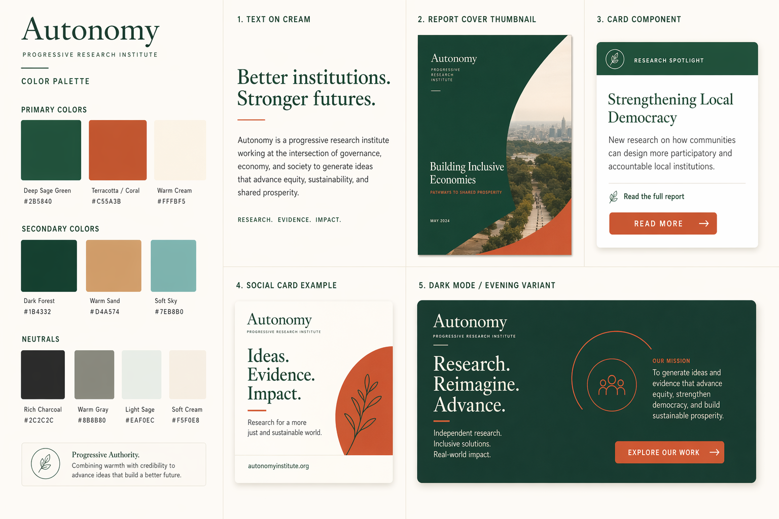
Current Brand Elements
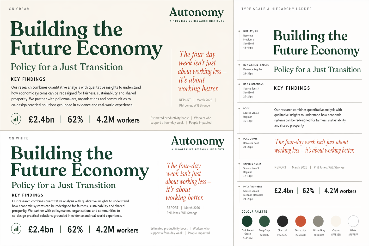
Color Palette
#333333
#FBC441
#F3993E
#CD3A18
#222222
#FFFFFF
Strengths
- Distinctive dark/amber identity — unlike any other think tank
- IBM Plex Serif is a serious, credible open-source typeface
- Memorable geometric logo mark
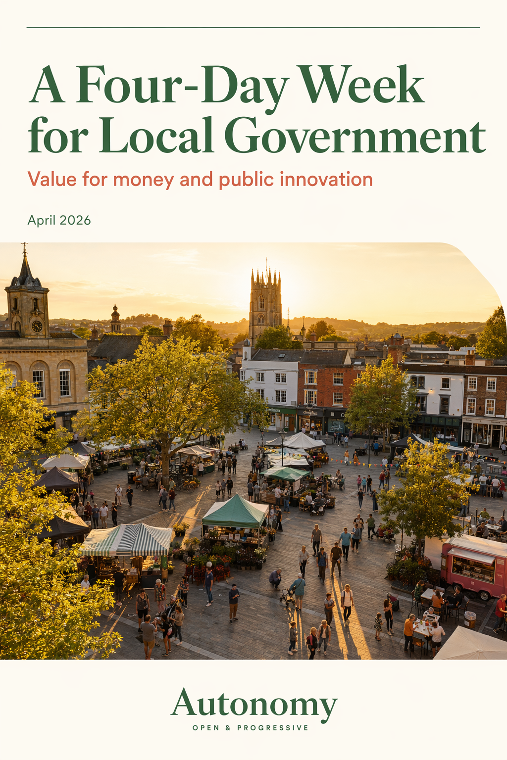
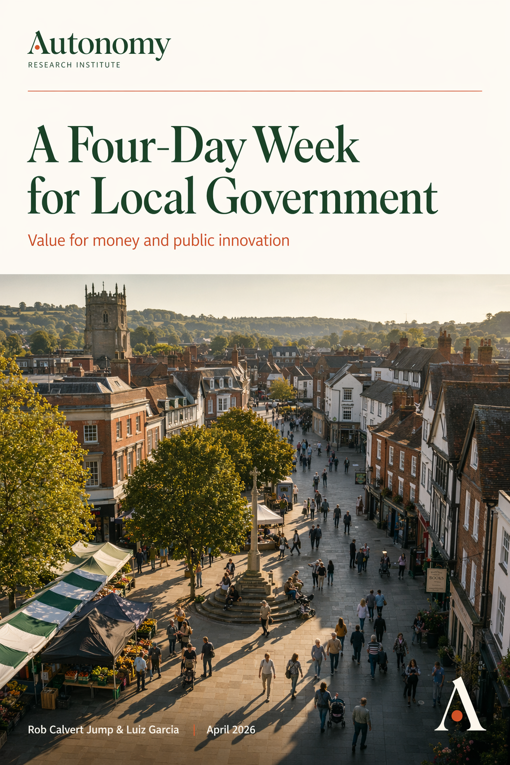
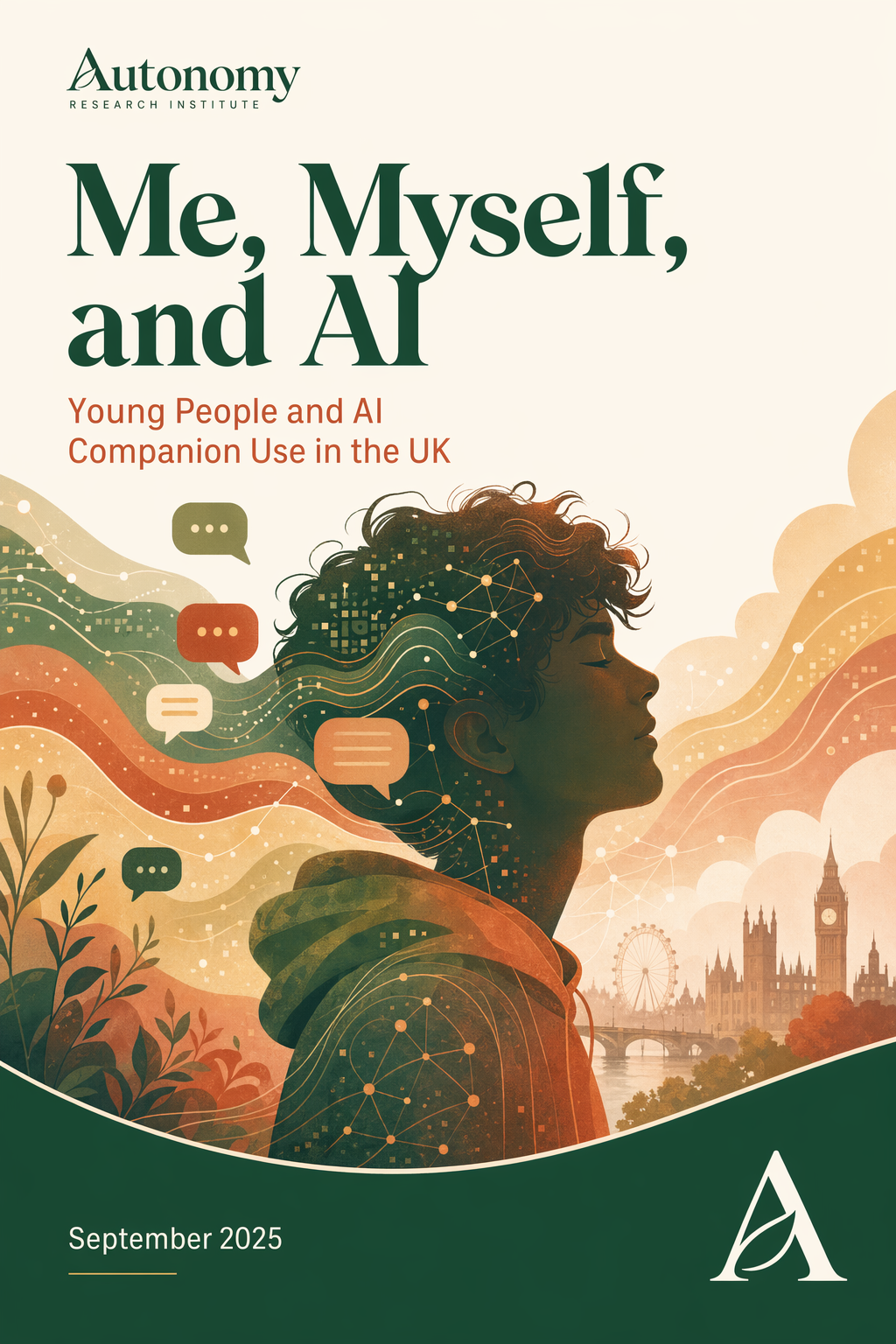
- Consistent report cover template
Weaknesses
- Dark background is heavy, oppressive, and tiring to read
- Single typeface at light weight creates visual monotony
- Main site and consultancy site look like different organisations
- Small font sizes (12-14px) are difficult to read
- The descending staircase logo motif can read as "decline"
- Website feels dated (circa 2018-2020)